Overview
A Custom Field represents the fundamental unit of data storage, created on an as-needed basis within your system. It is linked to a SmartSimple entity, such as a contact, organization, role, or activity. These fields can be accessed and managed either through the Global Settings section of your system or via the Entity-based Settings page within a UTA.
New custom fields are regularly introduced; currently, there are over 50 field types available for capturing and storing data. For a comprehensive list of Custom Fields, please refer to the Types of Custom Fields. Additionally, consult the Upgrades section of our Wiki for ongoing updates regarding the latest field types.
Custom Fields complement Standard Fields, which are automatically integrated into your system (for example, Name or Address are typical Standard Fields). While Custom Fields can be added, removed, and customized, Standard Fields generally cannot be altered, although renaming or modification may be possible.
All fields present data in configurable formats; for instance, they can be organized into tabs or displayed across multiple columns to prevent page clutter.
- The maximum number of custom fields that can be displayed on a single page is 400.
Accessing Custom Fields
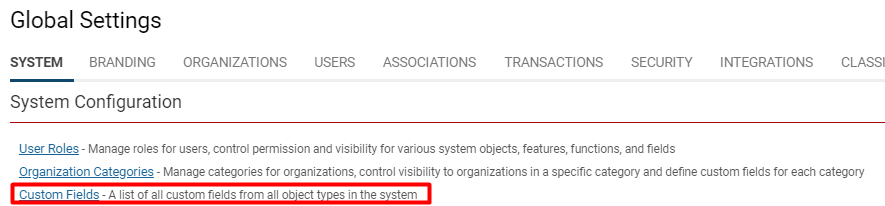
1. Click the 9-square menu icon located at the top right corner of your page.

2. Under the Configuration heading, select Global Settings.
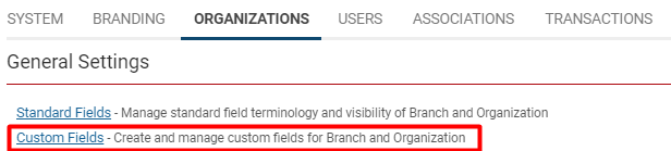
The hyperlink to Custom Fields will be accessible under each tab. Selecting the Custom Fields link under a specific tab will direct you to the custom fields associated with that tab’s purpose—for example, clicking on Custom Fields under the User tab will display all custom fields specifically related to users, both internal and external.
| System - Custom Fields | A comprehensive list of all custom fields across all object types within the system. |
| Organizations - Custom Fields | Create and manage custom fields for Branch (internal organization within the organizational hierarchy) and Organization (external entities). |
| Users - Custom Fields | Create and manage custom fields for users, including both internal Staff and external Contacts. |
| Associations - Custom Fields | Create and manage custom fields for associations, which may exist between companies and users or company-to-company relationships. |
| Transactions - Custom Fields | Create and manage custom fields related to transactions and transaction attributions. |
All custom fields for system objects
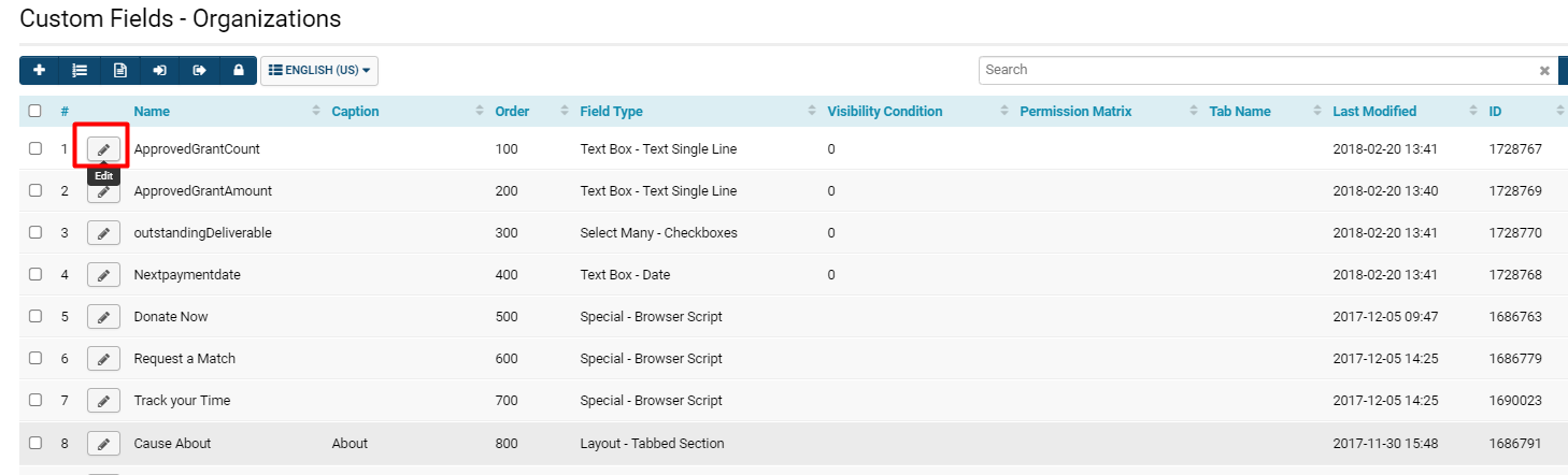
Custom fields for Organizations under the Organizations tab
Selecting a Custom Fields hyperlink from the Global Settings area will present a list of all available custom fields related to that system segment. To modify a Custom Field, simply click the pencil icon located to the left of the custom field name, as illustrated below:
- Utilize the Search function at the top right to filter through all Object Entities or specific UTA fields. Select or deselect options to refine your results.
- Tip: For troubleshooting, clear your previous search, select All Object Entities within the search bar, then sort by the Last Modified field in descending order to view recent changes to custom fields.
- Access all deleted fields by navigating to the second tab. The system retains deleted records indefinitely, allowing you to restore or permanently delete these fields.
- Purging is generally unnecessary, as Custom Fields consume minimal system storage.
- Restoring fields does not result in data loss.
Configuration - Essentials
This page serves as the primary repository for setup information common to most field types. For configuration options specific to a particular field type, please consult the corresponding Wiki page.
Common Custom Field Functions
At the top left of the Custom Field record, a row of buttons provides various functions related to the field.
The following table describes the functionality of each button from left to right:
| Custom Fields list | Clicking the list chart icon navigates to a list of all custom fields available within the current system section. For example, if viewed under the Organizations tab in Global Settings, it will display all custom fields related to Organizations. |
| New Custom Field (+ icon) | Clicking the plus icon initiates the creation of a New Custom Field within the current system section. For guidance on creating a new custom field and completing the relevant settings, please continue reading the subsequent sections. |
| Field Data (stack of coins icon) | This opens a page displaying all values stored within the field. Custom Field Data generally falls into two categories: text type fields (stored as text strings) and object type fields (including files such as documents or images). |
| Update History (reload icon) | This opens a page listing all updates made to the field's settings. |
| Search Reference (magnifying glass icon) | Displays all locations within the system where the custom field is referenced. Fields are fully searchable across related applications. For instance, role-level fields can be searched using the Search People feature or any application accessing contact data. Bulk search and replace operations can be performed via the Field Data button by specifying the old and new values. |
The following settings are common to nearly all Custom Field types:
- General Settings
- Display & Formatting
- Validation
- Feature Options
- Value Storage
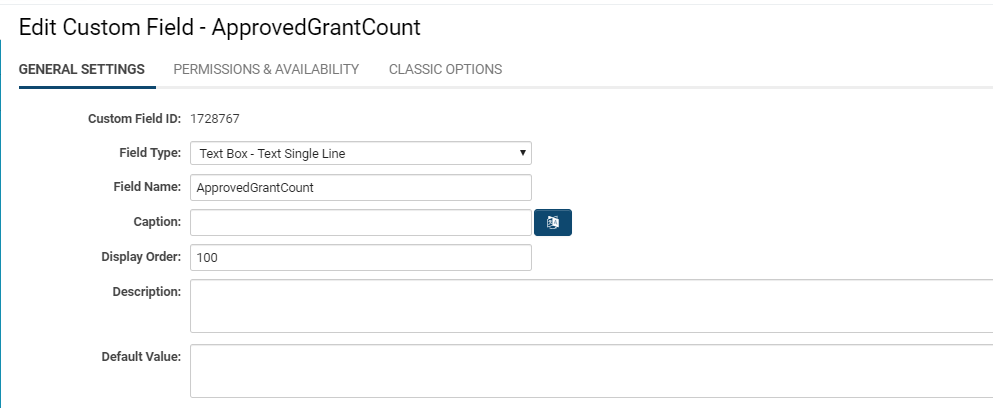
General Settings
The General Settings section appears immediately upon opening a Custom Field for editing.
| Option | Description | Format |
|---|---|---|
| Custom Field ID | The unique identifier assigned to the custom field.
| Not Applicable |
| Field Type | A selection of available Field Types.
| @fieldtype@ |
| Field Name | The internal name used to reference the user's input.
| @fieldname@ |
| Caption | The introductory text or question displayed before the field.
| @caption@ |
| Display Order | Determines the relative position of this field among others on the page.
| @displayorder@ |
| Description | A general definition or description of the custom field; this information is not displayed to end users. | @description@ |
Display Order with Related Entities
When adding custom fields to the primary contact entity and subsequently to roles associated with contacts, caution is advised as fields may become intermingled if they share identical display order values.
The following table identifies entities where this consideration is particularly important:
| Entity | Related Entity |
|---|---|
| Contact | Roles |
| Companies | Categories |
| UTA Level 1 Entities | UTA Level 1 Template Entities |
It is recommended to initiate the display order numbering for these related fields at higher values. For example, Role 1 may start at 5000, while Role 2 begins at 8000.
Display & Formatting
The Display & Formatting section of Custom Fields is accessible by scrolling down within the General Settings tab when editing a Custom Field.
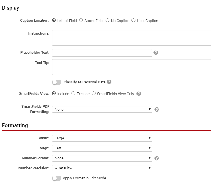
| Option | Description |
|---|---|
| Caption Location | Specifies the position and visibility of the caption relative to the field. Available options include: Left of Field, Above Field, No Caption, and Hide Caption.
|
| Instructions | Text entered here is displayed below the caption. Even if the caption is set to Hide Caption, any instructions defined will still appear above the input field. |
| Placeholder Text | Text entered here appears within the text box as placeholder text, which disappears once the user interacts with the field.
|
| Tool Tip | Displays text when the user hovers over the question mark icon adjacent to the field. |
| Classify as Personal Data | Used to identify fields containing personal data. |
| SmartField View | Determines whether to include or exclude this field from SmartField View (@SmartFields@), or to display it exclusively within SmartField Views. |
| SmartFields PDF Formatting | Specifies PDF formatting options when rendered from SmartField View. |
| Width / Max Width | Specifies the width of the input box. Options include Full, Large, Medium, and Small. |
| Number of Columns | Determines how many columns are used for display purposes. |
| Align | Controls the text alignment within the field: Left, Center, or Right. |
| Number Format | Specifies the format of numerical data when the field is in View mode, such as Comma, Currency, or Percent. |
| Number Precision | Determines the precision of numerical values displayed, including options like Whole Number, a specified number of decimals, or Nearest Ten. |
| Thumbnail Width | Defines the width of image thumbnails in pixels. |
| Thumbnail Height | Defines the height of image thumbnails in pixels. |
| Sort Order | Determines the sorting criteria for files uploaded to the field. Options include file name, file size, and upload date. |
| Stroke Colour | Allows specification of the stroke color. |
| Button Label | Defines the label for a custom button. |
| Apply Format in Edit Mode | Applies field data formatting while in Edit mode. |
| Fixed Column Widths | Establishes uniform column widths when multiple columns are specified. This is used with Layout fields. |
Validation
The Validation section is located under the General Settings tab and appears as follows:
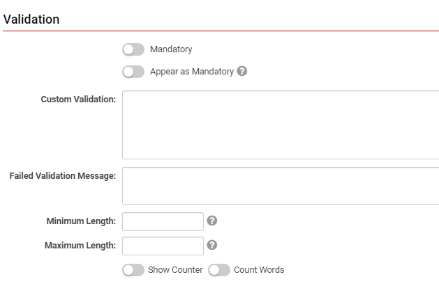
| Option | Description |
|---|---|
| Mandatory | Selecting this option designates the field as required and must be completed. |
| Appear Mandatory | This option causes the field to appear as required. It is typically used alongside browser scripts, JavaScript Validation, or Submit Logic that perform validation. From the user's perspective, the field usually displays a red asterisk (*) to indicate its mandatory status. |
| Custom Validation | Allows specification of validation rules using JavaScript syntax. |
| Failed Validation Message | Enter the message to be displayed if validation fails. |
| Minimum Length | Set the minimum number of characters required for the user's input in this field. The input must meet or exceed this minimum to pass validation. For example, a minimum of 9 characters may be appropriate for a mandatory Phone Number field. |
| Maximum Length | Set the maximum number of characters permitted for the user's input in this field. The input must be fewer than this maximum (and, if applicable, more than the minimum) to pass validation. For instance, a maximum of 6 characters may be suitable for a Postal Code field in a Canadian address. |
| Show Counter | Enabling this option activates a counter that displays the remaining number of characters the user may enter before reaching the maximum. It also indicates if the user has exceeded the maximum by showing negative values. |
| Show Words | Enabling this option restricts the maximum and minimum lengths, if specified, by the number of individual words rather than characters. |
| Exceeded Maximum Message | When either Show Counter or Show Words is enabled, this option becomes available. Input the message to be displayed if the user exceeds the maximum length for characters or words. |
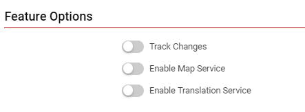
Feature Options
The Feature Options section within the Custom Fields settings is also found under the General Settings tab when editing a Custom Field. This section appears as follows:
| Option | Description |
|---|---|
| Track Changes | Enables logging of all modifications to specified Custom Fields or Standard Fields within the system, including within a Universal Tracking Application, contact, company, or transaction record. |
| Show Display Value in List Views | When enabled, the display value will be shown in List Views; by default, the stored value is displayed when fields are referenced. |
| Enable Multiple Select | Allows users to select multiple values from the list of available options. |
| Enable Map Service | Displays a map icon adjacent to the field name. Clicking this icon launches the user's selected map service and displays a map based on the field's content, provided a valid address is stored. |
| Enable Translation Service | Facilitates language translation of text entered into fields through integration with Google Translate. |
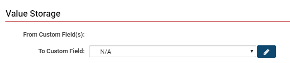
Value Storage
The Value Storage section constitutes the final area within General Settings when editing a Custom Field. It appears as follows:
| Option | Description |
|---|---|
| From Custom Field(s): | Displays the name of the source field from which the current field retrieves data; see Value Stores To. |
| To Custom Field: | Indicates the field to which this field will send data; see Value Stores To. |
Permissions & Availability
The second tab available when accessing a Custom Field is typically the Permissions & Availability section. The organization of permissions and availability varies depending on the Custom Field type and the system component to which it is attached. The options in this section may appear as follows:
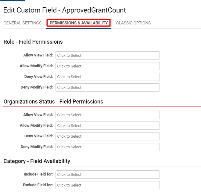
Access to a custom field is governed by permissions, which can be configured on the Permissions and Availability tab of any custom field. Permissions may be assigned to specific roles or statuses. For example, the Applicant role can be denied permission to view the Decision custom field to prevent premature disclosure of application approval or denial.
| Role - Field Permissions | Allow View Field: Select roles permitted to view this field. Users with these roles will see the field and its content when accessing a record. Allow Modify Field: Select roles permitted to modify this field. Users with these roles can view and edit the field's content. Deny View Field: Select roles that are denied permission to view this field. Users with these roles will not see the field on record details. Deny Modify Field: Select roles that are denied permission to modify this field. Users with these roles can view but cannot edit the field's content. |
| Organizations Status - Field Permissions | Allow View Field: Select statuses that grant permission to view this field. Only organizations with these statuses will see the field when accessing a record. Allow Modify Field: Select statuses permitted to modify this field. Deny View Field: Select statuses that are denied permission to view this field. For example, organizations with an Inactive status may be denied access as the information is unnecessary. Deny Modify Field: Select statuses that are denied permission to modify this field. |
| Category - Field Availability | Include Field For: Select organization categories permitted to access and complete this field. Exclude Field For: Select organization categories prohibited from accessing and completing this field. |
Visibility Condition
The Visibility Options section is accessible under the Permissions and Availability tab after enabling the Advanced Options feature.
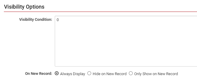
To enable Advanced Options, toggle the feature on from the top-right corner of the page.
The visibility of a custom field can be controlled through conditional statements entered in this section. Visibility conditions for new records can be set to one of the following: Always Display, Hide on New Record, or Only Show on New Record.
Classic Options
The final tab available when accessing a Custom Field record is typically the Classic Options section.
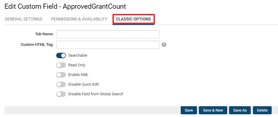
| Tab Name | Entering a value in the Tab Name field assigns the custom field to that tab.
|
| Custom HTML Tag | Use this field to add additional attributes to the field's HTML tag. For example, you may include style="background-color:00ff00" to change the background color of the field box. Searchable Read Only Enable KML Disable Quick Edit - Enabling this option prevents users from modifying the field via the system's Quick Edit functionality. Disable Field from Global Search - Enabling this option excludes the field from results generated by the system's Global Search functionality. |
Custom Field References
This feature assists in assessing the impact of modifications to a custom field by identifying where the field is referenced within the system. Each custom field includes a Search Reference button, represented by a magnifying glass icon in the action bar.
When activated, this feature searches for references to the custom field using variable syntax across multiple areas, including:
- Other custom field options and visibility conditions, such as JavaScript Validation, Visibility Condition, and calculated values.
- Template formulas
- Submit buttons
- Submit Logic
- SmartCheck Validation
- Workflow Tasks
- Workflow connectors
- Data class policies
Import and Export Custom Fields
The Import and Export features enable the transfer or duplication of custom fields between entities or even across different instances of SmartSimple. Custom fields are exported and imported in XML format.
To export a group of custom fields, click the Export button located at the top of the custom fields list. A window will appear displaying the custom field settings in XML format:
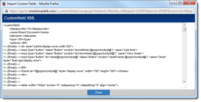
The XML block representing the entire set of custom fields in the list will be shown. Individual custom fields are delineated by specific tags. Copy the desired XML block (which can be edited, for example, to adjust display order using a text editor), then click the Import button at the top of the target custom fields list. Paste the XML block into the provided text area and confirm the import by clicking Import at the bottom of the dialog.
Most field settings are included in the copied fields. Exceptions include:
- Any Field Permissions
- Any Field Permission Matrix assigned to the original custom field
- Any Value Stores To setting assigned to the original custom field
- The Description setting
Field Permissions and Field Permission Matrices may be assigned to the new fields using the Batch Update feature.
Since custom field IDs are unique within the system, they are not copied during export/import. Newly created custom fields will receive new IDs.
Refer also to the Custom Field Import Wizard.
Custom Field Types
A comprehensive list of Custom Field Types is available on the Custom Field Types page.
Changing Text to Uppercase or Lowercase
You may alter the case of text entered in a custom field by inserting the following code into the HTML Tag box within the custom field settings.
To convert entered text to uppercase:
onChange="this.value=this.value.toUpperCase();"
To convert entered text to lowercase:
onChange="this.value=this.value.toLowerCase();"
This code executes as soon as the user enters a value and clicks outside the field, without requiring the user to save.
Alternatively, you may use onBlur instead of onChange:
onblur="this.value=this.value.toUpperCase()"
onBlurtriggers when focus moves away from the current field.onChangetriggers when the content of the field has changed.