Overview
The “Special - Button” custom field facilitates the addition of configurable buttons that, when activated, can open pages within the same window, in a new tab, or within a modal window. Previously, to achieve this functionality, system administrators were required to create a “Special - Browser Script” custom field intended for opening various platform pages.
For instance, a button can be created on a Level 1 record (such as a grant) to access the assignment grid, modify a user’s organization profile, or even establish a new Level 2 record. Additionally, you can specify the manner in which the content is displayed upon activation.
In this configuration, a user profile is displayed in a modal window when the “Special - Button” custom field is activated.
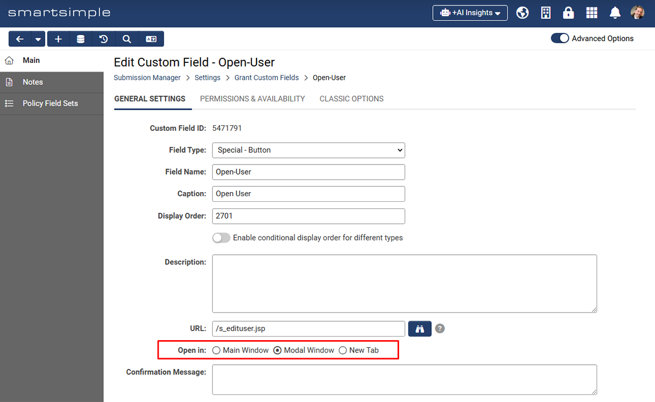
The custom field settings enable functionality for opening content within a modal window. For example, a button can be added to an application to allow users to conveniently edit their organization profile without navigating away from the current page. A custom confirmation message can also be included.
Configuration
Creating a New Special Button
- Navigate to UTA Configuration Settings > Level 1 tab > Custom Fields > Click the plus button to create a new custom field.
- From the Field Type dropdown menu, select the newly available option titled “Special - Button”.
- Optionally, enter a Caption .
- In the URL field, click the binoculars icon to search for a specific URL. For example, to create a button that allows users to edit their profile, select “People” for the Object Type and “Edit My Profile” for the Action. Once satisfied with the object selection, click Apply. The URL field will then be populated with a relative path to the chosen object. Note: Relative paths to other sections of the system, such as the assignment grid, may also be entered.
- Next, in the Open in field, specify how the URL object should be displayed when the button is activated. For instance, select “Modal Window” if you wish for the object to open in an overlay above the current content to maintain context. Choose “New Tab” if the content should open in a new tab within the Tab Bar located at the bottom of the page.
- (Optional) If you would like to present a custom message to the user upon clicking this button, enter the relevant text in the Confirmation Message. This message will be displayed to the user prior to showing the object. For example, if clicking the button will redirect the user to another area of the system, a warning may be appropriate in case there are unsaved changes on the current page.
- In the “Display” section, specify how the button should be presented to the user. For example, if you prefer not to show a Caption to the left of the button, select “No Caption” under Caption Location. This will result in the button being aligned to the left of the record without a caption.
- For Button Label, input the text that you wish to appear on the button (Example: “Edit my profile”).
- (Optional) You may select an Icon and an Icon Style if desired. Icons will be positioned to the left of the button label text.
- (Optional) If users require additional assistance or context regarding the button, you may enter text in the Tool Tip or Instructions.
- (Optional) Navigate to the Permissions & Availability tab to establish permissions for this button.
- Finally, click Save.

