Overview
This article addresses accessibility in relation to SmartSimple Cloud. We hold the belief that individuals with a diverse array of sight, hearing, movement, and cognitive abilities should have the opportunity to utilize the system. Our commitment is to ensure that all users can access the system in a manner that upholds their dignity and independence. This article provides information pertinent to ensuring the accessibility of your system.
Should you have any inquiries or encounter issues that appear to be related to accessibility, please reach out to our support team.
We strive to achieve conformance with the Web Content Accessibility Guidelines (WCAG) 2.1 at level AA or higher. For further details, please refer to our voluntary product accessibility template.
If you are a system administrator tasked with configuring a system, we encourage you to review the Accessibility - Advanced section below to ensure your system is set up to be accessible.
Note: Compliance with accessibility guidelines is a collective responsibility. The manner in which you configure your system and the content you input into the system will influence the overall accessibility of your system.
Accessibility - Essentials
Disabilities Defined
In the context of web accessibility, a disability is defined as a condition or barrier that restricts an individual's ability to interact with or access information or functionalities of a web application. Disabilities may be permanent, temporary, or situational. It is estimated that approximately one in five individuals has a disability. Disabilities are typically categorized into four main areas.
The four disability classifications are: Visual, Hearing, Movement, and Cognitive.
Visual
This classification encompasses individuals with low vision, those who are completely blind, as well as individuals with color blindness or other visual impairments, including vision loss due to injury, cataracts, and other factors.
Hearing
This classification includes individuals who are deaf and those who experience varying degrees of hearing loss.
Movement
This classification includes individuals with conditions such as Cerebral Palsy, Quadriplegia, and various forms of restricted movement, as well as those with arthritis or other conditions and injuries.
Cognitive
This classification includes individuals with developmental delays, dyslexia, autism, ADHD, Down syndrome, anxiety, and may also encompass non-native speakers and the elderly.
Assistive Technologies
Assistive technologies refer to any tools or devices used to enhance, maintain, or improve functional capabilities. These technologies empower individuals to overcome or mitigate disabilities. Common examples of assistive technologies include: eye tracking devices, switches, sip and puff devices, refreshable braille keyboards, screen readers, and screen magnifiers.
Examples of assistive devices include: eye tracking devices, switches, sip and puff devices, and refreshable braille keyboards.
Screen Readers
The most commonly utilized screen readers include:
- JAWS (Job Access with Speech) used with Chrome: Download | Instructions
- NVDA screen reader: Download | Instructions
- Apple’s OS X VoiceOver (integrated screen reader for Mac)
Screen readers on mobile devices typically employ a gesture-based user interface, while desktop versions utilize a keyboard-based interface.
Guidelines and Legislation
Guidelines and legislation regarding accessibility are continually evolving and may vary by jurisdiction. Below are several key guidelines and legislative measures. Additional information on web accessibility can be found on Wikipedia.
WCAG
The Web Content Accessibility Guidelines, commonly referred to as WCAG, represent a set of international standards published by the World Wide Web Consortium (W3C). These standards provide a series of guidelines accompanied by testable success criteria. In essence, WCAG is guided by four fundamental principles.
- Perceivable: Is the interface and information presented perceivable?
- Operable: Is it possible to navigate and operate the application?
- Understandable: Is the information presented comprehensible, and is the system usable?
- Robust: Can a variety of assistive technologies be utilized with the system?
For further information, please visit the W3C's page on WCAG 2.x.
WAI-ARIA
Web Accessibility Initiative - Accessible Rich Internet Applications, abbreviated as ARIA, comprises a set of specific recommended standards for developers. ARIA is primarily designed to enhance the accessibility of web pages featuring dynamic content and specific user interface components.
For additional information, please visit W3C's page on WAI-ARIA.
Section 508 (USA)
Section 508 of the U.S. Rehabilitation Act mandates that federal agencies provide information in an accessible manner.
For further details, please visit Section 508, and also refer to the ICT Testing Baseline for Web Accessibility.
ADA (USA)
Americans with Disabilities Act (ADA) generally requires organizations based in the United States to provide access to information for individuals with disabilities and prohibits discrimination based on disability.
For more information, please visit the ADA website.
California AB 434 (USA)
California legislation requires all state agencies and entities to display signed certification demonstrating compliance with the Web Content Accessibility Guidelines (WCAG) 2.0 or higher.
To learn more, please visit the ca.gov website.
European Accessibility Act (EAA)
The European Union mandates that its member states adhere to Web Content Accessibility Guidelines 2.1 (WCAG 2.1) Level AA standards.
For additional information, please visit EUR-lex (Directive of the European Parliament and of the Council).
EU Web Accessibility Directive
The European Union (EU) Directive on the Accessibility of Websites and Mobile Applications stipulates that public sector organizations across the EU must comply with WCAG standards. The European standard for technology accessibility in the public sector is referred to as EN 301 549.
For further details, please visit ETSI to view the EN 301 549 PDF.
Equality Act 2010 (UK)
The UK Equality Act 2010 protects individuals from discrimination in both the workplace and broader society. Under this act, public sector organizations are required to ensure that their websites are accessible, as they are considered to be a provision of service.
Related Links:
Accessible Canada Act (Canada)
The Accessible Canada Act (BILL C-81) applies to the government and federally regulated private sector.
Related links:
AODA (Ontario, Canada)
Accessibility for Ontarians with Disabilities Act or AODA generally requires adherence to WCAG guidelines.
For further information, please visit aoda.ca (Accessibility for Ontarians with Disabilities Act) and ontario.ca (Accessibility for Ontarians with Disabilities Act, 2005).
DDA (Australia)
The Disability Discrimination Act (DDA) of 1992 prohibits discrimination based on disabilities. The DDA mandates that websites comply with WCAG 2.0.
For additional information, please visit Disability Discrimination Act 1992.
Accessibility Overlays, Toolbars and Plugins
Accessibility overlays for websites may be referred to by various names such as plugins, applications, software, and toolbars. They are often marketed as comprehensive solutions for accessibility. However, this assertion is misleading. An overlay on your system or a public website does not render your system accessible or compliant. An overlay cannot substitute for effective design, content, coding, or testing. Some individuals contend that overlays (toolbars) are inherently discriminatory. Furthermore, other vendors have developed plugins to disable these overlays. Users with disabilities frequently find overlays to be disruptive, as they adversely affect performance and counteract the intended purpose.
For further reading, the following articles address this topic:
- Overlay Fact Sheet
- Should I use an accessibility overlay? | The A11y Project
- A guide to accessibility overlays | Site Improve
- Toolbar Plugins/Overlay Widgets for Website Accessibility Aren’t ADA Compliant | Kris Rivenburgh
- Automated Lies, with one line of code | Karl Groves
- Don't Get Scammed: Why You Should Avoid Quick-fix Overlays For Web Accessibility | Fred Mercedes
Additional browser extensions are available to block accessibility overlays, such as AccessiByeBye.
Testing for Accessibility
The SmartSimple Cloud platform undergoes regular accessibility testing conducted by internal teams and, upon request, by third-party testers. Primary testing is performed using the JAWS screen reader on desktop computers. Compliance with accessibility guidelines is a shared responsibility. The manner in which you configure your system and the content you input into the system will influence the overall accessibility of your system.
ICT Testing Baseline for Web Accessibility (section 508)
Download our Voluntary Product Accessibility Template (PDF)
Automated Testing
There exists a variety of tools available for system testing.
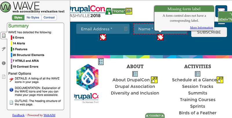
Wave toolbar (Free) - A browser extension that highlights potential issues directly on the page.
Screenshot of Wave
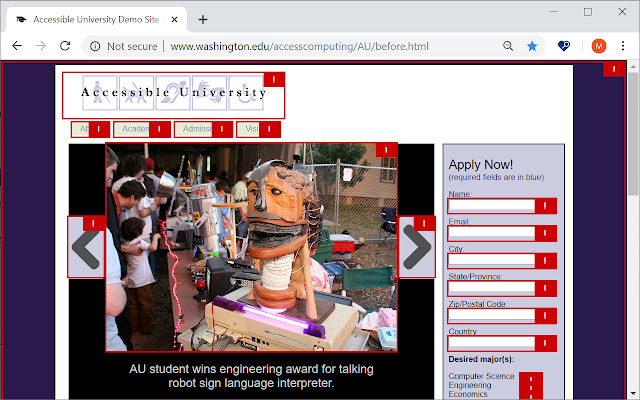
Accessibility Insights for Web (Free) - A browser extension that identifies potential issues inline at the page level.
Screenshot of Accessibility Insights
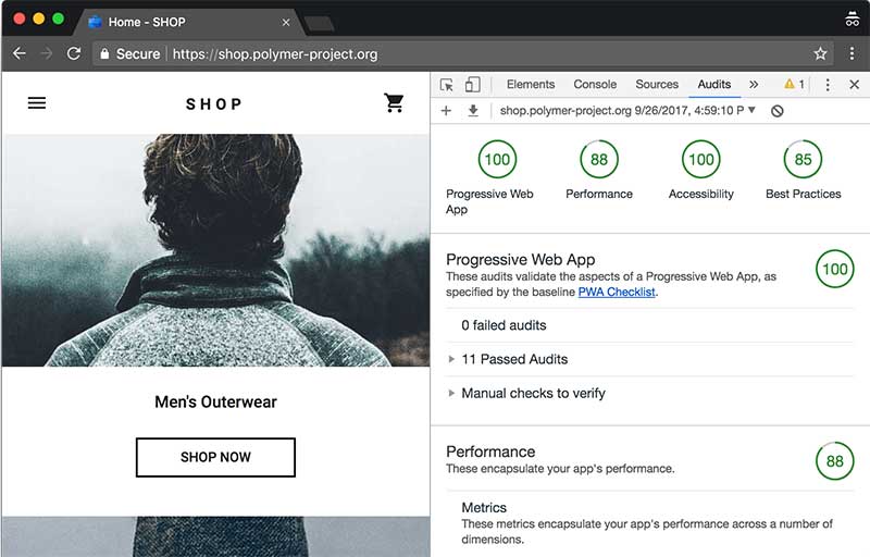
Google Lighthouse (Free) - Conducts an accessibility audit at the page level.
Screenshot of Google audit
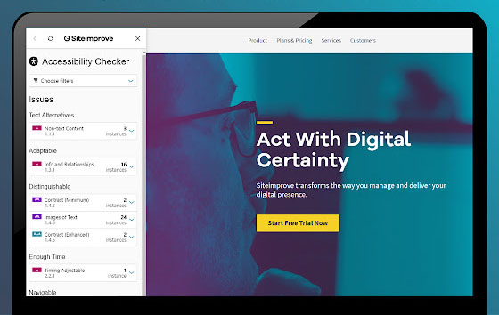
Siteimprove (Free) - A browser extension that provides an overview of accessibility issues at the page level.
Screenshot of Siteimprove
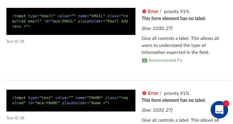
Tenon (Trial) - Displays code snippets and guidelines.
Screenshot of Tenon
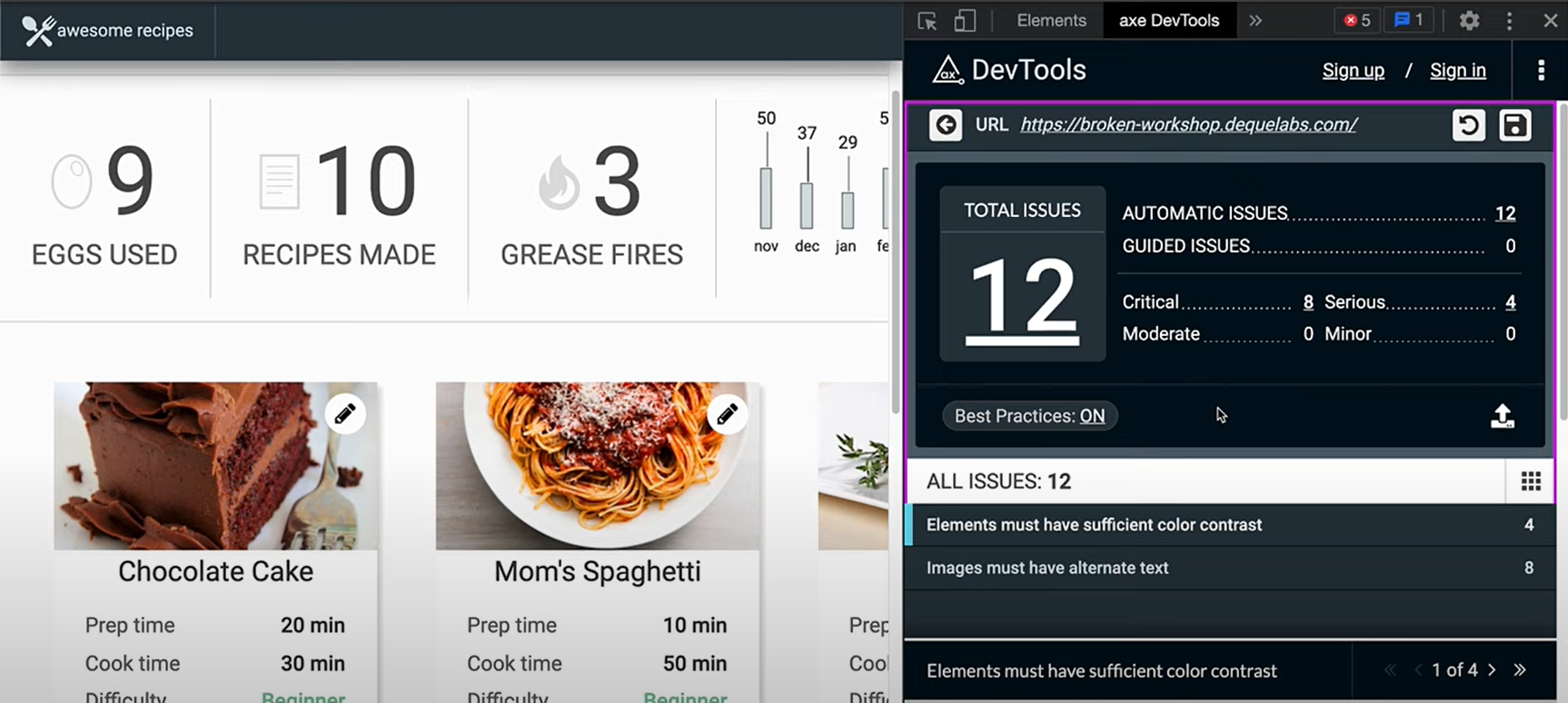
AXE DevTools (Free) - A browser extension with a premium tier of upgrades.
Screenshot of AXE in Google Chrome DevTools
Other Tools
W3C Markup Validator - Validates the markup of web documents (HTML, XHTML, etc.).
W3C CSS Validator - Validates the markup of CSS.
Accessible Colors - Assesses the contrast ratio of text against a background, including size and weight.
Webaim Web Accessibility Contrast Checker - Evaluates the contrast ratio between foreground and background colors (colored text over a colored background).
a11y Web Accessibility Contrast Checker - Assesses the contrast ratio of content on a web page (colored text over a colored background).
Beyond Automated Testing
Automated tools may yield false positives and may not identify usability errors. Therefore, it is advisable to:
- Establish a user testing group (a group of five individuals is often recommended as optimal for testing).
- Conduct usability testing.
- Consider engaging a third-party audit.
Our Design, Development, and Testing Methodology
Our design methodology employs an inclusive framework such as WCAG. The design process commences with empathetic research and analysis, followed by the application of the POUR methodology. We ensure our experiences are Perceivable, Operable, Understandable, and Robust. This approach allows us to focus on the needs of individuals with diverse abilities, including those with varying degrees of sight, hearing, movement, and cognitive challenges such as dyslexia, autism, and anxiety. It also encompasses disabilities that are permanent, temporary, or situational. The design methodology and reviews are conducted both prior to and following modifications, incorporating feedback loops with the community as changes are implemented and refined.
Our development methodology parallels the design methodology, taking into consideration similar factors. This includes, but is not limited to, the creation of accessible code and adherence to best practices as outlined in WCAG and by W3C. We perform internal code reviews and utilize automated testing tools such as SonarQube for continuous code inspection.
Our accessibility testing methodology aligns with WCAG standards and the standardized baseline testing prescribed by Section 508. Additionally, we may engage external auditors and experts to assist in various aspects of the quality assurance process. We also employ automated testing tools.
Accessibility - Advanced
As a System Administrator, it is imperative to ensure that the configuration of your system remains accessible. Below are key considerations to keep in mind when modifying your system.
Define Alternate Text for the Logo
The system logo is located in the upper left corner of the header within your system. It is essential to provide equivalent alternative text for this logo. Typically, the alternative text for this image would be your organization's name or the designated name for your system.
To modify the alternate text for your logo, navigate as follows to enter your desired text in the Logo Text input field:
System Administration (gear icon) >> Global Settings >> Branding (tab)
All Links and Buttons Must Be Descriptive
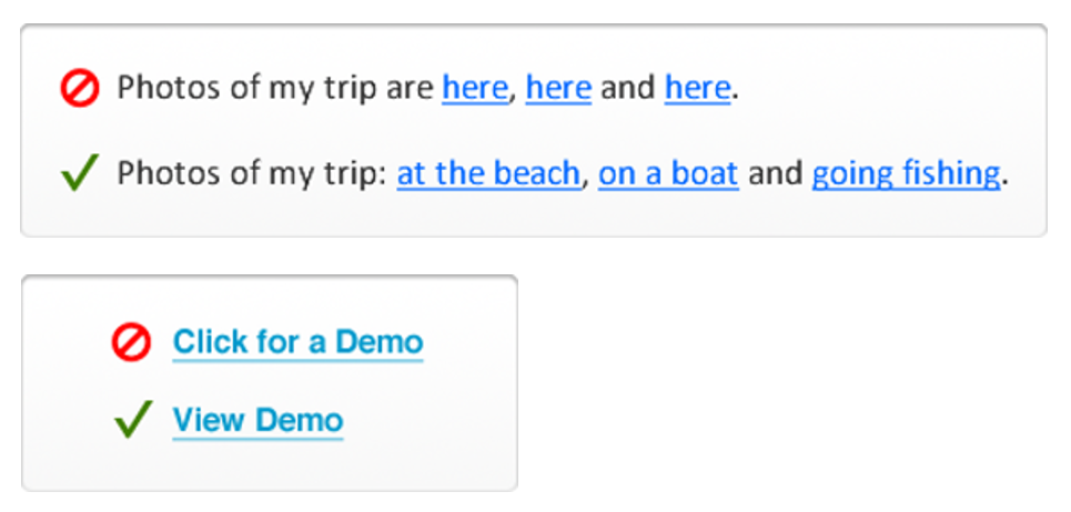
When adding links or buttons within your system, avoid using the phrase click here! Users utilizing screen readers navigate from link to link and will be unaware of the action that will occur when the link is activated out of context.
Links must be descriptive (indicating the destination, purpose, or expected outcome).
Links and buttons should describe the destination, state the purpose, or indicate what will happen.
Examples of effective link/button text include: "Open budget," "View demo," "Start application," "Visit smartsimple.com."
Additionally, refrain from using open as a button label, particularly if multiple buttons are present on a page. If you are opening or editing something, ensure that it is accurately described or labeled. This will allow users of screen readers to understand the function of each button.
Keep link text concise and specific; lengthy descriptions can be challenging to comprehend and may increase cognitive load. Aim to select a few words that best encapsulate your link, and avoid using identical text for links that direct to the same locations.
Title Tags on Custom Templates
In certain scenarios, you may wish to define the title for a specific page within the system. For instance, if you utilize the Page Layout option of Custom on a signup page, you can manually edit the title located between the title tags in the HTML.
Table Syntax and Adding HTML
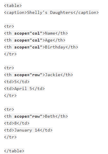
When entering HTML into your system and incorporating a table for display purposes, consider indicating it with role=presentation. Table headers should utilize TH and table data should utilize TD. It is also advisable to consider adding scope (col, colgroup, row, rowgroup) to headers. Ensuring the use of proper semantic structures will facilitate machine readability by assistive technologies.
Furthermore, ensure that you properly open and close your tags. If you open a TR, TH, TD or DIV, make certain that a corresponding closing TR, TH, TD or DIV is present. The appearance of correctness in your browser does not guarantee machine readability by assistive technology.
Employ proper semantic structures when adding HTML to your system.
For further information, visit WebAIM's page on creating accessible tables.
The BR Tag
Avoid using BR tags to create visual spacing. Instead, encapsulate your text within a P tag or a block-level element such as a DIV and add a class or style as necessary to manage the visual space. The only appropriate context for utilizing a BR tag would be for poetry, song lyrics, and arguably address fields. When a screen reader encounters a BR tag, it will halt reading, necessitating that the user manually advance to the next line. Consequently, using a double BR tag can be cumbersome for users of assistive technology. For additional details, visit w3.org (the BR Element).
Refrain from using BR tags to create visual space.
Nested Tags
HTML tags should be nested in a proper order, meaning that the tag opened most recently is always the next tag to close. Example if you open a SPAN inside a DIV make sure you close the SPAN before you close the DIV.
Nest tags in proper order.
Bold and Italics
HTML5 specifications state that important text should be denoted with the STRONG tag not the B tag for bold text. In addition, text should be denoted with the EM tag not the I tag for italicized text. Avoid using the b and i tags as they are not perceivable to user agents like screen readers. Visit www.w3.org (Using B and I tags)
Use Strong and EM tags not B and I tags.
Underlined Text
Generally don’t underline text on the web that is not a link. Underlines are strongly perceived to be a clickable link which will confuse and frustrate users. Use strong or em or header tags to denote importance and avoid the u tag. The U tag is not intended to convey semantic meaning. According to w3schools.com underline text should only be used for things like misspelled words or proper names in Chinese.
Font Tag
The font tag is not supported in HTML5 its use should be avoided. Visit w3schools.com
Declare Language
Your system will automatically declare the language on system generated pages, but if you add a static content or a page in a SmartFolder you will need to declare the language.
Example in the HTML tag add lang="en" for English and lang="es" for Spanish and lang="fr" for French.
Visit ISO Language Codes to learn more.
Use Title Bars (Headings) and Tabs
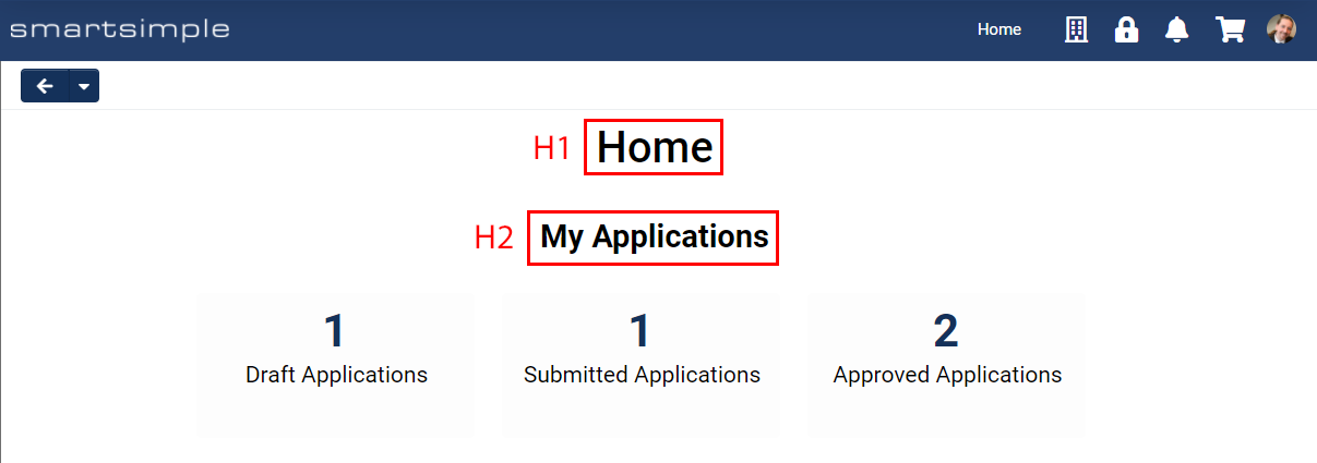
Chunk like content under the Layout – Title bar custom field to make it easier to navigate to sets of content. The layout – title bar custom field is H2 (heading level 2). In contrast the name field at the top of object pages is an H1 (heading level 1). By using the title bar field, people using assistive technology can quickly jump or skip content to get from one header (section of content) to another.
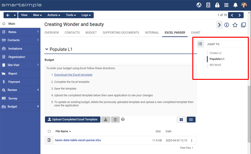
Note: Many users prefer longer pages over many tabs. Some users may find it difficult to navigate between tabs, especially scrolling tabs when there are more tabs then can fit on screen. Also, your users may prefer to scroll down over navigating left to right as this a common practice on mobile devices. For these reasons your users may prefer longer pages with title bars instead of many tabs. You may also want to consider enabling or disabling the Title Bar Navigation Pane. This setting will display a navigation pane on your forms that allows your users to easily navigate between various titled sections of a form. This setting is found under menu icon > global settings > branding tab.
The optional Title Bar Navigation Pane as seen on a Level 1 grant.
When configuring portals, each portal section Title will display as an H2 heading. If you want the text specified for Caption of the Main Menu link to be displayed as an H1 heading, toggle on Display As Title.
The setting to have the Main Menu link displayed as a Heading 1 inside a portal.
How the H1 and H2 headers look when using the white paper theme in a portal with Display As Title toggled on.
Contrast Ratio of Text and Background
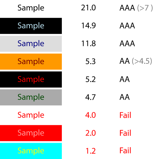
The contrast ratio of text to background color must be 4.5 or more to meet WCAG guidelines. You can check color combinations with these tools: Contrast Checker or WebAIM's Contrast Checker
Contrast ratio of text over different backgrounds and the WCAG requirements
Be extra careful if you are placing text over an image as the same rules apply. System colors can be modified by changing the branding.
Never Use Color Alone to Convey Meaning
When adding content to your system be mindful you cannot use color alone to convey meaning as a color-blind or visually impaired user may not be able to detect the difference. Make sure content you add has accompanying text, icons or divide the content up in a meaningful way.
Do not use color alone to convey meaning.Nested Tags
HTML tags must be nested in a proper sequence, meaning that the most recently opened tag is always the next one to be closed. For instance, if you open a SPAN inside a DIV, ensure that you close the SPAN before closing the DIV.
Ensure that tags are nested in the correct order.
Bold and Italics
According to HTML5 specifications, important text should be marked with the STRONG tag rather than the B tag for bold text. Additionally, text should be marked with the EM tag instead of the I tag for italicized text. It is advisable to avoid using the B and I tags, as they are not perceivable to user agents such as screen readers. For further information, please visit www.w3.org (Using B and I tags).
Utilize the STRONG and EM tags instead of B and I tags.
Underlined Text
It is generally advised not to underline text on the web that is not a hyperlink. Underlined text is often perceived as a clickable link, which may confuse and frustrate users. Instead, use strong or em tags, or header tags to indicate importance, and avoid utilizing the u tag, which is not intended to convey semantic meaning. According to w3schools.com, underlined text should only be employed for specific instances such as misspelled words or proper names in Chinese.
Font Tag
The font tag is not supported in HTML5, and its usage should be avoided. For more information, please visit w3schools.com.
Declare Language
Your system will automatically declare the language on system-generated pages; however, if you add static content or a page in a SmartFolder, you will need to declare the language manually.
For example, in the HTML tag, add lang="en" for English, lang="es" for Spanish, and lang="fr" for French.
Visit ISO Language Codes to learn more.
Use Title Bars (Headings) and Tabs
Organize similar content under the Layout – Title bar custom field to facilitate navigation through content sets. The layout – title bar custom field corresponds to H2 (heading level 2). Conversely, the name field at the top of object pages is an H1 (heading level 1). By utilizing the title bar field, individuals using assistive technology can quickly navigate between different sections of content.
Note: Many users prefer longer pages over multiple tabs. Some users may find it challenging to navigate between tabs, particularly scrolling tabs when there are more tabs than can fit on the screen. Additionally, users may prefer scrolling down rather than navigating left to right, as this is a common practice on mobile devices. For these reasons, users may favor longer pages with title bars instead of numerous tabs. You may also want to consider enabling or disabling the Title Bar Navigation Pane. This setting will display a navigation pane on your forms, allowing users to easily navigate between various titled sections of a form. This setting can be found under the menu icon global settings branding tab.
The optional Title Bar Navigation Pane as displayed on a Level 1 grant.
When configuring portals, each portal section Title will be displayed as an H2 heading. If you wish for the text specified for the Caption of the Main Menu link to be displayed as an H1 heading, toggle on Display As Title.
The setting to display the Main Menu link as a Heading 1 within a portal.
Illustration of how the H1 and H2 headers appear when using the white paper theme in a portal with Display As Title toggled on.
Contrast Ratio of Text and Background
The contrast ratio between text and background color must be 4.5 or greater to comply with WCAG guidelines. You can assess color combinations using the following tools: Contrast Checker or WebAIM's Contrast Checker.
Contrast ratio of text against various backgrounds and the requirements set forth by WCAG.
Exercise caution when placing text over an image, as the same rules apply. System colors can be modified by adjusting the branding.
Never Use Color Alone to Convey Meaning
When adding content to your system, it is crucial to remember that color alone should not be used to convey meaning, as users who are color-blind or visually impaired may not be able to discern the differences. Ensure that any content you add is accompanied by text, icons, or is organized in a meaningful manner.
Avoid using color alone to convey meaning.
Incorporate Text Alternatives for Media
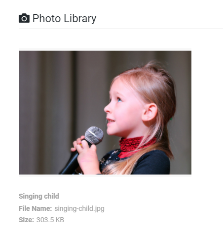
When uploading media such as images to the Upload - Multiple Files Storage custom field set to Enable Media Library, the Alt tag will serve as the title, which users may edit post-upload. By default, the title and Alt tags utilize the file name. Screen readers and other assistive technologies depend on this Alt text to describe images for individuals with visual impairments. Additionally, it is beneficial to have this text available in the event that the image fails to load.
When uploading videos to the Upload - Multiple Files Storage custom field set to Enable Media Library, enabling Closed Captioning allows users to upload closed caption files in multiple languages. Furthermore, users may upload closed captioning in a single language, with the system providing automatic translation to create new caption files for other languages.
If you are incorporating custom content within a SmartFolder and referencing it elsewhere in your system, ensure that you include alt tags or transcripts for your media in the HTML.
Alt text must accurately describe the purpose or intent of the media.
An image displayed on a record utilizing the Upload - Multiple Files Storage set to Media Library.
Guidelines for Web Applications
When composing text instructions, captions, or any other text-based content intended for your system, consider the following:
- Utilize the clearest language possible and avoid jargon.
- Segment content into manageable parts.
- Limit sentences to fewer than 25 words.
- Maintain conciseness; excessive writing diminishes the likelihood of being read.
- Evaluate the reading level of your content. Microsoft Word features a built-in readability check, and websites such as Readable provide readability assessments and suggestions.
- When referencing a button or link, ensure you mention it by name; do not rely on location or color alone.
The following articles offer insights on writing for web applications:
- 16 Rules of Effective UX Writing - UX Planet
- Writing for Web Articles & Videos - Nielsen Norman Group
Layout Considerations
Avoid using location, text size, or color alone to denote important or secondary information. Users utilizing screen readers may not discern that the second column with smaller text is of lesser importance.
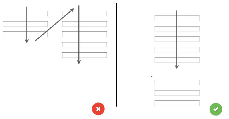
Implement a linear, logical layout; single-column formats are preferred for usability and accessibility.
Preference for single-column layout
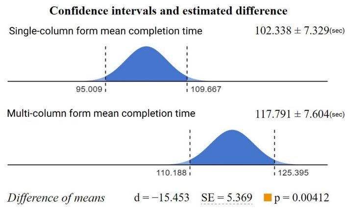
Research indicates that single-column forms can be completed more rapidly and users generally feel more comfortable filling them out.
Single-column performance and user confidence.
Conversely, multiple-column forms may result in:
- Omitted fields
- Data entered into incorrect fields
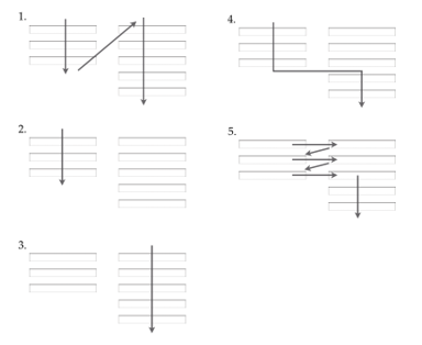
- Confusion regarding reading order
- Challenges for assistive technologies, such as screen magnifiers
Multiple-column forms may create reading order challenges.
Visit baymard.com (Avoid Multi-Column Layouts) for further information regarding design issues associated with multiple-column layouts and the reasons they are best avoided.
Session Timeout
If you opt to establish a Session Timeout to prevent unattended connections, please consider that users relying on assistive technology may require three times longer to complete a task compared to other users. Therefore, you might contemplate a timeout duration of 90 minutes or a range between 30 minutes and 3 hours, depending on your user base and the nature of the data within your system. In the absence of a defined session timeout, the system will automatically log out users after 24 hours.
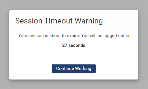
Should you implement the session timeout feature, users will receive an alert with the option to continue working if they have been inactive for the specified duration.
Display of the session timeout alert as seen by users after a specified period of inactivity.
The session timeout settings can be found under Menu Icon > Global Settings > Security Tab.
Media Playback and Photo-sensitivity
When utilizing the Upload - Multiple Files Storage custom field with the media library functionality activated, users have the option to play video and audio files. Videos and audio do not play automatically to avoid interference with screen readers, which navigate by auditory means; any sound playing upon page load could significantly disrupt this process. An exception exists if the user specifically requests the video.
If you integrate your own media content and supporting HTML into your system, ensure that you do not enable autoplay for any video or audio media. Additionally, avoid using blinking or flashing media, as media that flashes more than three times per second may provoke seizures in users with photosensitivity or epilepsy. For additional information, please refer to w3.org (Three Flashes or Below Threshold).
Usability – Essentials
Usability serves as a metric for evaluating the effectiveness of User Interface design. An interface is deemed usable when it is perceived as easy, enjoyable, efficient, and effective to use and learn.
This article outlines methods for testing usability issues within your system.
What is UI?
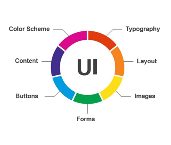
User Interface (UI) refers to a collection of screens containing elements such as buttons, icons, and text with which users interact.
Modifications to the User Interface occur when you move a custom field, add a button, or alter a color.
When discussing UI, we consider the following questions:
- Is there sufficient color contrast?
- Is the content concise and easy to read?
- Is the layout well-organized with adequate white space?
- Are the pages responsive?
- Is it compatible with assistive technology?
UI Concerns
What is UX?
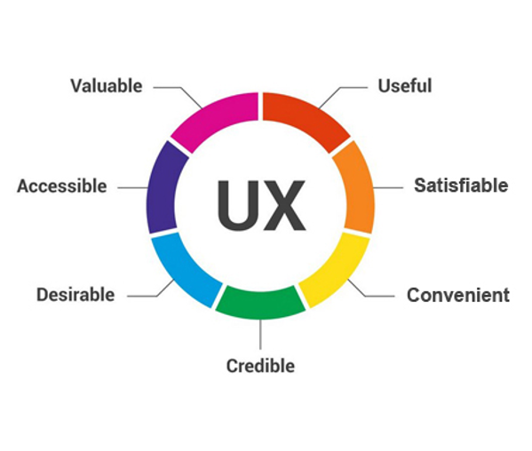
The term User Experience (UX) encompasses all aspects of the user's interaction with the company, its services, and products.
UX pertains to the user's feelings while purchasing, opening, using, and disposing of a product or service.
Enhancing the application process to make it easier or quicker constitutes an improvement in UX.
When discussing UX, we consider the following questions:
- Can I accomplish my intended task easily, quickly, and simply?
- Do I genuinely wish to use this product or service?
- Do I trust and appreciate this product or service?
UX Concerns
What constitutes a usability issue?
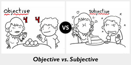
A usability issue is any factor that hinders the system from being easy, efficient, and effective to learn and utilize. Usability issues are objective, such as the contrast ratio of text against a background, and are not subjective or based on personal preference, such as a dislike for a specific color.
Usability issues are objective
How can I assess usability issues?
Established standards known as Heuristics are utilized to evaluate the usability of user interface designs. Further information regarding these heuristics can be found in this Nielsen Norman Group article.
The following ten heuristics are summarized as tools for identifying usability issues within a user interface.
10 Heuristics for Enhanced User Interface Design
Originally formulated in 1990, Jakob Nielsen's ten heuristics for improved usability in design remain relevant today and serve as a benchmark in numerous contemporary interface systems. They are as follows:
1. Visibility of System Status
Consider an elevator: when I press the button and it illuminates, I am aware that the elevator is on its way. I can also observe the estimated wait time until its arrival.
Elevator illustrating visibility of system status
It is essential to inform users of ongoing processes through appropriate feedback. Do your users understand what is happening, what is expected of them, and what will occur next?
You can fulfill these criteria by:
- Indicating progress (how far along they are and what remains)
- Displaying space/time (how much space/time is left)
- Highlighting changes (drawing attention to modifications)
- Communicating expected actions (informing users of their next steps)
- Providing status updates (what is the current state of an element?)
2. Match Between the System and the Real World
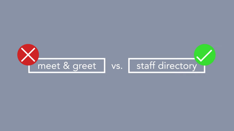
If I present two labels marked "meet & greet" and "staff directory," would you understand what to expect upon clicking “meet & greet”? Utilizing familiar language facilitates comprehension for users.
Utilize familiar language
Adhere to conventions, provide previews, and organize information logically. Consider whether the information is presented in a manner that is logical, comprehensible, and aligns with user expectations.
You can fulfill these criteria by:
- Employing familiar words, phrases, concepts, and metaphors
- Adhering to established conventions
- Organizing information logically
- Offering previews or miniature representations of the content
3. User Control and Freedom
Have you ever found yourself in a conversation with no polite way to excuse yourself? In system interactions, accidental clicks are common; thus, it is crucial to provide users with an emergency exit, such as a cancel, back, or undo option. Do not leave users trapped in an undesirable state.
Avoid leaving users in unwanted situations.
Ensure that users can navigate forward and backward throughout any process and that they can access information in their preferred format. Ask yourself: can users easily locate the information they seek in the format they require?
You can fulfill these criteria by:
- Providing pathways for navigation (undo/redo)
- Offering various methods to explore information (searching, filtering, viewing options)
- Allowing users to exit a process (cancel, close, exit)
4. Consistency and Standards
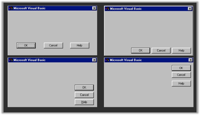
Maintain consistency and adhere to industry standards. If the OK button is typically placed in a specific location, consider following suit.
Ensure UI consistency and adherence to industry standards
Ensure that buttons and links are consistently named, located in the same areas, and positioned where users expect to find them. Ask yourself: do I know where to locate desired links and buttons, do I understand their functions, and are they consistently placed? Are recurring button and link configurations arranged reliably?
You can fulfill these criteria by:
- Maintaining links, buttons, and information in the same order and locations
- If multiple methods exist to perform an action or reach the same destination, ensure that the same labels are used for links and shortcuts
5. Error Prevention
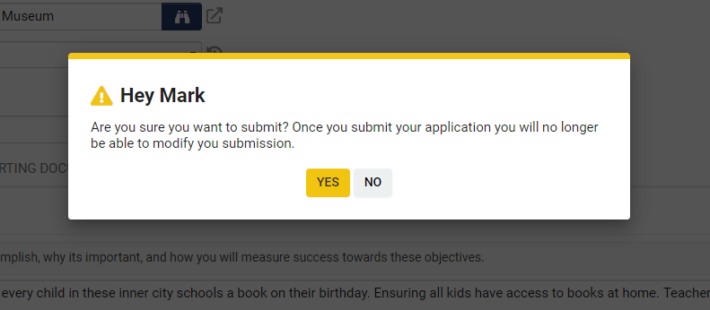
Have you ever unintentionally sent an email? It can be quite embarrassing when someone accidentally clicks “reply all.” Assist users in preventing errors. If clicking a button will result in significant changes or potential harm, inform the user of the consequences and provide a pathway forward.
Assist users in preventing errors
Mitigate errors by providing additional information, offering instructions, checking for error conditions, and refining processes. Ask yourself: what common errors might users encounter, and how can I help prevent these?
You can fulfill these criteria by:
- Providing necessary information and warnings to guide users
- Ensuring that links and button captions accurately describe their actions (avoid vague phrases such as “click here”)
- Eliminating conditions that may lead to errors or advising users when they occur
- Refining processes to minimize errors
6. Recognition Rather Than Recall
If I ask you What is the capital of Canada?, I am requiring you to recall the answer. It is significantly easier if I ask Is Ottawa the capital of Canada?, as you only need to recognize the answer.
Facilitate user recognition of answers or actions. (Parliament buildings in Ottawa)
Reduce cognitive load on users by encouraging recognition over recall of information. Ask yourself: can users easily recognize the actions they need to take?
You can fulfill these criteria by:
- Making objects, actions, options, and directions visible or easily retrievable
- Avoiding reliance on user memory
- Eliminating codes and obstacles
- Providing visual representations
7. Flexibility and Efficiency of Use
Assist users in achieving their objectives more rapidly and with less effort by providing accelerators.
An accelerator, such as the double-tap feature on Instagram to “like” an image instead of clicking the heart icon, enhances efficiency. Another example is using CTRL + C to copy quickly instead of navigating through menus.
You may enhance a user’s application experience by offering default options or pre-filling data from previous applications.
Provide accelerators to users.
Facilitate users in accomplishing their goals more efficiently by incorporating shortcuts, default options, and other accelerators. Ask yourself: can we assist users in achieving their goals more rapidly and with less effort?
You can fulfill these criteria by:
- Incorporating shortcuts for frequently used functionalities
- Providing default options
- Utilizing list views with available options where feasible
8. Aesthetic and Minimalist Design
Every piece of information on a page competes for attention and diminishes overall visibility (excessive content negatively impacts UX).
In terms of signal-to-noise ratio, Google exemplifies high signal, while a cluttered weather site represents excessive noise.
Therefore, consider whether all elements on the page are essential for helping users achieve their objectives. If not, contemplate removing or simplifying them.
Comparison of Google and a weather site illustrating signal to noise.
Ensure that the user's intended actions and information are clearly visible, eliminating distractions. Ask yourself: is it evident what actions are required, and are there any distractions hindering task completion?
You can fulfill these criteria by:
- Positioning essential information above the fold (initial viewable area)
- Minimizing the signal-to-noise ratio
- Being selective with color and imagery
- Removing redundant information to maintain conciseness
9. Assist Users in Recognizing, Diagnosing, and Recovering from Errors
This encompasses three actions:
- Indicate that an error has occurred through visual and warning messages
- Explain the problem to the user in plain language
- Provide a pathway for resolution, including shortcuts or actions to rectify the issue
An error message indicates that an error has occurred, explains the issue, and provides a pathway for resolution.
Aid users in understanding and resolving errors with clear messaging that elucidates the problem and outlines corrective actions. Ask yourself: when encountering an issue, do users comprehend what went wrong and how to rectify it?
You can fulfill these criteria by:
- Ensuring clarity in messaging using plain language
- Always providing or suggesting a solution
- Educating users on the nature of the situation (what is happening and why)
- Offering a pathway for resolution
10. Help and Documentation
Ideally, a system should operate without the need for documentation; however, when documentation is necessary, ensure that:
- It is accessible where required
- It outlines concrete steps
- The instructions are concise
Additionally, remember that many users prefer not to read instructions.
Ensure that help and documentation are clear, concise, and readily accessible.
Assist users in understanding expectations and procedures by incorporating context-sensitive instructions, highlighting new features, and outlining changes in functionality. Ask yourself: is my help documentation readily available? Can users comprehend the required actions? Are users informed of new functionalities and changes?
You can fulfill these criteria by:
- Providing context-sensitive assistance
- Offering examples and recommendations
- Highlighting new or modified functionalities
- Providing additional guidance
- Listing concrete steps for execution
- Maintaining brevity and conciseness
Final Remarks
Whether you are implementing changes to your system or collaborating with a team to do so, it is imperative to utilize the aforementioned heuristics to evaluate the impact of modifications on your system's usability. If you identify an issue, discuss it with your team or contact support. Most issues can be addressed through configuration; however, if you encounter matters beyond configuration, please consult with us to enhance SmartSimple Cloud for all users.


