Overview
A Portal is the term used by SmartSimple to describe the graphical user interface encountered by a user upon logging in.
The Portal interface for each user is determined by the user role and the configuration set by the Global Administrator. This article seeks to provide an overview of how to configure portals for users utilizing the portal builder. We will explore the available options for creating a portal and provide guidance on optimizing these options for effective use.
Example of a Portal
Once a user has been activated, they will have the ability to log into your SmartSimple instance. 
All components of a user's portal—including the Main Menu links displayed in the top header, the graphics or text shown on each page, the user's personal menu items, and more—are highly customizable.
Portal Building – Essentials
User Roles
User roles are utilized to organize or group similar users together and, in conjunction with permissions and other configurations, dictate what individuals can view and perform within SmartSimple. User Roles are additive in nature, allowing a user to hold multiple roles, which need not be mutually exclusive. Typically, users are categorized based on their activities, such as applicants, reviewers, and approvers, as well as by department, including accounting, sales, and partners. Prior to constructing a portal, it is crucial to define user roles within your system. New user roles can be established by navigating to the Menu Icon >> Roles and Security >> User Roles. It is important to note that we adopt a most restrictive approach regarding permissions; thus, if one role denies a particular action, it supersedes all other permissions. Consequently, if a user possesses three roles and two allow a specific action while the third denies it, the user will be unable to perform that action. Therefore, as a general practice, it is advisable to grant permissions rather than deny them within a role, thereby enhancing the user’s capabilities within the system.
The Plan
Before commencing the portal construction process, it is prudent to plan what each user will require to see and do within their portal. For instance, consider a grant applicant who will likely need to:
- View available funding programs and apply to them.
- Monitor the status of their ongoing applications and make modifications as necessary.
- Update their personal profile and/or the profile of their organization.
- Access a list of items that require immediate attention, such as submitting a report or revising an application.
The aforementioned points can be utilized to develop straightforward use cases for our sample grant applicant portal. With a clear understanding of User Roles and the anticipated actions of the users within the system, we can determine the optimal location for portal creation.
Common Aggregated Portal vs Single Role Portals
There are two methodologies available for creating a portal. One can establish the portal based on the Common role, which is aggregated, indicating that assets are shared across multiple roles, or one can create a portal based on a single role. Opting for the latter means that assets will not be shared, necessitating users to switch between roles.
Common Aggregated Portal
It is advisable to create a portal based on the common aggregate role. This role differs from all other roles in that it is automatically generated within the SmartSimple system. Any assets added to the common role can be permissioned for visibility to all or selected roles created within your system. To utilize this option, construct your portal on the common role. When creating an asset, such as a section within the common role portal, you can set permissions for that asset to be viewable by specific roles. This enables the construction of assets, such as help links, that can be shared among all user roles. If modifications to the help link are required, changes can be made in one location, ensuring that all users will see the updated information. If a user has multiple roles, they will be able to view and perform actions based on all permissions granted to their roles. Lastly, creating assets within the common role eliminates the need for users to switch between portals via a dropdown in the header, as they can consistently access whatever they have permission to view and perform.
Single Role Portal
This portal configuration is generally not recommended. With this approach, a portal is created for each individual role. For example, the applicant portal is constructed on the applicant role, while the reviewer portal is built on the reviewer role. The disadvantage of this method is that if a help link is necessary, it must be created for each role. Consequently, if a change to the link is required, it must be updated in each role. Users possessing multiple roles will encounter a dropdown in the header that permits switching between applicant and reviewer portals; however, only one portal can be viewed at a time, restricting access to all functionalities permitted for the user simultaneously. Although configuring a single portal per role may be straightforward, it tends to be more challenging to maintain and may result in a suboptimal user experience, particularly for individuals with multiple roles (e.g., being both an employee and a grant manager).
Structure of the Portal
The portal header comprises multiple elements:
- Logo
- Header Links
- Notifications
- Menu
- System Administration
- My Profile
Logo
By default, the system logo will be displayed in the top left corner of the header. This logo should measure 112 pixels in height and approximately 250 pixels in width, formatted as a PNG file. While the width of the logo may vary, the height remains constant. A transparent background is recommended for the logo to accommodate any colored background on the header. Alternatively, an alternate logo may be displayed by uploading a different logo into a SmartFolder and selecting the SmartFolder option. Furthermore, a distinct logo from a SmartFolder can be specified for each supported language. For instance, users who speak Spanish may view a different logo than those who speak English.
User Menu
The user menu is located at the far right and displays the user's initials, name, or photo. This menu is designed to contain links relevant to the user, such as options for updating the user’s profile, the user’s organization, and potentially switching the user’s language. When creating a link in this menu, it is advisable to keep the caption concise, ideally limited to one or two words, such as “Edit Profile” or “My Profile.”
| Link Type | Description |
|---|---|
| Organization Profile | This link type directs the user to their organization profile. By default, if the user has permission to edit the profile, they will be taken directly into edit mode. This setting can be toggled off if the intention is to direct everyone to the profile in view mode. |
| Custom | This link type can redirect the user to any page within your system; for instance, to access the dashboards, enter “/iface/dashboard.jsp.” It is important to always use relative URLs to ensure links function correctly across different servers and that your system operates as intended. |
| Drop Down | This option is not recommended. This legacy setting was utilized with the default header and enabled the addition of a drop-down menu within the user menu. |
| Language | Utilize this link type to provide a language dropdown menu on your portal. Users will be able to switch the portal to any enabled language. It is crucial to note that if multiple languages are supported, translations for all content must also be entered into the system. For example, translations must be specified for every menu link and section added to the portal. This can be accomplished via a language dropdown configured for those assets. Additionally, in other areas of the system, such as custom field configuration pages, translations must be provided for every caption. |
| Change Password | This link type directs the user to the change password screen. |
| SmartFolder | This link type is used to display a SmartFolder within your portal. For instance, if resources such as help documentation are stored in a SmartFolder, this link can be added to the user menu, allowing the user to access that SmartFolder directly in the current window, a modal window, or a new window. |
| User Profile | This link type directs the user to their personal profile. By default, if the user has permission to edit the profile, they will be taken directly into edit mode. This setting can be toggled off if the intention is to direct everyone to their profile in view mode. |
Main Menu
The main menu will be aligned with the user menu. Three types of content can be included in the main menu: a single page, sections, and subtabs, which function as a dropdown menu of links. Essentially, a combination of links and dropdown links will be present, with each link directing the user to a specific location. The main menu is intended to contain links to UTAs or other designated areas of the system. Note: only the most crucial links that need to be consistently visible should be included in the main menu. If a link does not require constant visibility, it may be better suited as a shortcut. When creating main menu links, it is advisable to limit the number of links to five or fewer for optimal usability. An excess of links may increase cognitive strain on users; thus, it is recommended to maintain simplicity in portal design. Additionally, strive to keep the captions of these links to one or two words.
Two types of main menu links: the page and section or the sub tab
The Body of the Portal
Within the body of the portal, a page will be displayed. The user can click a link in either the main menu or user menu to change the displayed page within the portal's body. Additionally, navigation to other pages can occur from within the current page. Inside that page, sections will likely be present. Each section can be considered as a box or container, within which content such as list views, charts, text, or shortcuts can be added.
Choosing a Layout
If a link in your main menu or user menu does not direct you to an existing page within the system, you can create a page by selecting the content type designated as sections. A section can be added using the plus button, or a layout can be created by using the “Add layout” button, which arranges sections. It is recommended to create sections in a single column format, as this will render optimally across all screen sizes and provide a better experience for users utilizing assistive technology.
Creating a Page
Each portal consists of a collection of pages. To create a page for your portal, please follow these steps:
System Administration (gear icon) >> Users (tab) >> [Portals]
- Edit the desired portal. Alternatively, you can also access the portal for editing by going to System Administration (gear icon) >> Roles and Security >> User Roles and [Edit] a role with an activated portal.
- Under the Portal Page title bar, click the plus button to add a portal page. Assign a Name and Caption to your page.
- If you prefer not to display this new page in the top header, toggle off the setting Display As Header Link. This page can still be referenced via a shortcut link, but it will not appear in the header.

Portal pages can be displayed or hidden in the header using the Display As Header Link toggle
Creating a Section
To incorporate sections into the page, please set the Content Type to Sections. This action will unveil theming options. Themes can be utilized to define a specific aesthetic for the portal page. Certain traditional themes (such as Traditional or Whitepaper) do not include pre-made section templates. However, more recent themes (such as Website, Overlook, Portfolio, and Management) offer additional pre-made section templates that facilitate the customization of a page to serve as a landing page, dashboard, profile, or event page.

Once a theme has been selected, you may proceed to add sections to your page in one of three methods:
- Manually add sections to your page
- Add sections from a layout picker
- Add sections from a template picker
Creating Sections From Layout
A layout picker enables you to designate specific areas of the page for various purposes. To create sections using the layout picker:
-
Click on the button depicted below labeled Create Sections from Layout.

Button for Create Sections from Layout
-
This will display the layout picker, allowing you to select how to arrange the various sections on the page. Click the preferred layout.
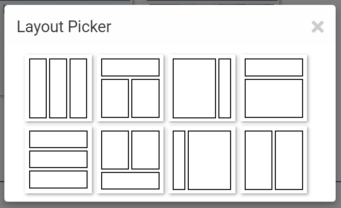
- Follow the prompts for each new subsection until you have completed all sections.


Creating Sections From Template
Furthermore, it is possible to create sections from templates that have pre-defined section types.
Note: The Traditional and Whitepaper themes do not provide pre-defined templates.
-
Select the button illustrated below labeled Create Sections from Template.
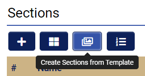
Button for Create Sections from Template
- This action will bring up the template picker, allowing you to select the types of sections you wish to include on the page. Please click on the desired template.
- The page will refresh, and you will see the predefined sections listed under the Sections title bar. Click on each section to customize them to meet your specifications.

Previewing a Section Theme
To modify the theme for a section or to simply preview a theme:
- Navigate to the Main Menu or User Menu link with the content type designated as Sections.
- Select the preferred theme from the drop-down menu.
- Click Save.
- Return to the root of the portal using the hierarchical navigation.
- Click the Preview button.
This approach allows you to experiment with various themes for each page.
Note: The functionality and configuration options differ for each theme. For example, the Traditional theme allows for the rendering of a section in split screen, whereas this feature is not available in the Whitepaper or Website themes.
Traditional Theme
The Traditional theme is characterized by boxes surrounding each section. This theme accommodates a greater amount of content within a smaller area. It is typically utilized by individuals managing numerous tasks who require access to extensive information.

Note: In the shortcut section, I have disabled margin and shadow for the shortcut section. This setting can be found on the display tab of that section.
Whitepaper Theme
The Whitepaper theme is distinguished by its absence of boxes, presenting a clean and white aesthetic with additional padding, larger content for improved visibility, and center-aligned text. This theme is generally preferred by individuals engaged in a limited number of straightforward tasks or those who favor a more modern appearance.

Website Theme
The Website theme is designed with visual elements in mind. This theme resembles a website with graphical banners and image shortcuts. It is typically employed by individuals such as applicants or volunteers, and when there is a need to convey a specific brand identity or tone. Learn how to create a website-themed portal page.

Note: To create the top banner, I utilized a section container, uploaded a background image, set the background opacity to low, and changed the font color to white. These controls are accessible on the display tab of this section. Within the sub-section, I created a text template and adjusted its width to 65% to ensure that the text does not obscure the image at most resolutions.
Overlook Theme
The Overlook theme features a layout that is well-suited for dashboards and multiple columns that span the entire width of the page.

Portfolio Theme
The Portfolio theme features a user-centric layout with a constrained width that includes a new banner.

Management Theme
The Management theme is characterized by a constrained width and is suitable for multiple column layouts with rounded corners and no drop shadows.

Sample home page with the Management theme
Section Settings
General Tab
| Setting | Description |
|---|---|
| Name | Utilized for reference purposes and is not visible to the end user. |
| Type | Defines the nature of the section. |
| Title | Displayed within the section. |
| Icon | Displayed adjacent to the title. |
| Description | Utilized for reference purposes and is not visible to the end user. |
| Instruction | Used for adding text beneath the title. |
Display Tab
| Setting | Description |
|---|---|
| Width | Controls the width of a section. It is generally advisable to avoid utilizing this setting, as a single-column layout is preferred for usability and accessibility. Please note that while a specified width may appear satisfactory on your screen, it may not translate well for users with varying screen sizes. We recommend leaving this setting empty to allow the section to render in full screen. If a width must be specified, it is advisable to use a percentage for scalability. |
| Height | Controls the height of a section. Similar to width, it is generally advisable to refrain from using this setting. Users may have different screen resolutions, resulting in a layout that appears acceptable for you but not for them. By default, the height will accommodate the content within. If this setting is used, it may result in content being truncated and the appearance of a scrollbar within the section. If it is necessary to use this setting, a pixel value may be specified, but it is generally best to leave it empty. |
| Shadow | Disables the shadow effect. |
| Margin | Disables the margin. |
| Background Color | Controls the background color of the section. |
Permission Tab
When creating a section under the common role (recommended), the permission tab will be visible. This tab allows you to specify which roles will have visibility of this section.
Section Order
The order of menu items is arranged from left to right. You can reorder the sections by activating the enable reorder button, followed by dragging and dropping rows to achieve your desired arrangement.
Moving a Section
Once a section has been created, it can be relocated within your portal using the move button located in the submission bar.
Portal Page Section Types
Upon creating a main menu link and designating it to sections, a variety of section options will be available. Below is an overview of each section type.
Chart
This section type facilitates the creation of interactive charts directly from a list view. It enables the visualization of charts and data tables, allowing users to delve deeper into the data for a more comprehensive analysis. For instance, grants may be aggregated by status, and users can switch to a table view for direct access to specific grants. Furthermore, users have the option to download charts in PNG, JPG, PDF, and SVG formats.


To configure a chart section:
- Create a list view containing the information you wish to chart. If this list view is to be utilized exclusively for charts, ensure that the configuration is restricted to the list view, preventing it from appearing in the standard list view dropdown for users.
- In the desired section, select the type labeled “Chart.”
- Choose the appropriate list view and/or filter.
- If you wish to allow users to toggle between the chart and the underlying table, enable view options. If view options are enabled, you may also enable the search panel when in table view.
- Select the chart type, such as pie or bar.
- Select the fields to be mapped to the X and Y axes and input the desired captions.
- Choose the aggregation type, such as sum or count.
- Save the configuration.
Custom Link
The custom link feature allows for the creation of a link to any area within the system. Utilize the lookup button to select the desired area within the system to which you wish to link, which will automatically populate the URL field. Alternatively, you may manually enter a URL to other areas within the system, ensuring the use of a relative path for security reasons, as linking to external pages is not permitted.
List View
The list view section type enables the display of a list view from another area of the system. For example, it can showcase a list of applications in progress or a list of open calls available for application from a UTA. It can also present a list of organizations or users. To configure, select the desired list view and optionally select a filter before saving.
Show New Button: This option allows users to create a new record from the list view. For instance, if viewing a list of level 1 applications, users may be permitted to create a new level 1 application from this section.
Show Search Panel: This option provides search functionality within the list view in the portal.

List view featuring a new button and search functionality
List View - Mixed Record Type
The mixed record type list view section enables the creation of a list view consisting of different record types. This is typically utilized to generate a consolidated task list of all to-dos, eliminating the need to create individual lists as separate sections within the portal. To configure:
- Select a list view and click the + button.
- Repeat this for each list view you wish to include in your mixed record type section (for example, UTA, User, Organization); please note that each list view must have a filter.
- Select the desired number of columns (if default buttons are enabled, they will appear in the first column).
- Assign captions to each column header.
- Choose a column by which to sort.
- Click Save.
Note: The purpose of this section type is to display a list of records from multiple areas, providing users with a straightforward method to access and edit records. It is essential to ensure that the selected list views contain the same number of columns with uniform information types in corresponding columns. For instance, if combining three list views, the first column in all should contain similar data, such as the name or title of the object.
Row Clickable: This option allows users to open a record by clicking anywhere on the row. If this option is enabled, there is no need to display an open button on the row.
Show Search Panel: This option displays a search input, enabling users to refine the contents of their list view.

Media Files
The media files section type allows for the display of media uploaded to applications within a designated portal section. For instance, it is possible to showcase all artwork submitted during the application process for those applications that have received approval.
Additionally, there is an option to filter the displayed media by media type (video, audio, images), as well as by the status and type of the record.

Section Container
The section container type differs from other section types as it serves to manage the layout of sections. Typically, a section container is utilized to encompass another section. For example, within a website theme, one might employ a section container to present a background image that spans the full width of the page. Subsequently, a text section could be placed within this container, restricting its width to 70% of the page. This configuration would create a banner with an image background and text overlaying that image, while allowing the user to view more of the background image due to the constrained text width.

Section in Tabs
This section type is designed to display multiple sections within a single section. For example, one might have a section titled "Applications," which could contain several tabs such as "Applications in Progress," "Applications in Review," and "Applications Funded." The user may click on any tab to view the corresponding list. Additionally, there is an option to display the record count for each tab, as well as the inclusion of a new button and a search panel.

Shortcuts
If you have configured shortcuts in the shortcuts tab of the common (or your preferred) role, this section type enables you to display those shortcuts within a section. Shortcuts are available in four styles (Icon, Aggregate, Image, and Text) and typically link to an area of the system, such as a list view.
You can select which shortcuts to display in each section via a lookup. This functionality allows for multiple shortcut sections, each containing different shortcuts. If no shortcuts are selected, all shortcuts for which you have permission to view will be displayed.
It is advisable to include only one style of shortcut in each section; for instance, a section should consist solely of image shortcuts or solely of icon shortcuts. It is generally recommended to avoid mixing and matching shortcut styles.

Icon, aggregate, and text style shortcuts as they appear in the Default theme. Mixing and matching of shortcut styles in a single section should generally be avoided.

Icon, aggregate, and text style shortcuts as they appear in the White Paper theme. Mixing and matching of shortcut styles in a single section should generally be avoided.

Icon, aggregate, and text style shortcuts as they appear in the Website theme. Mixing and matching of shortcut styles in a single section should generally be avoided.
Image style shortcut as it appears across the three themes. Mixing and matching of shortcut styles in a single section should generally be avoided.
Text Template
The text template section is utilized for the display of text-based information, including notices, instructions, or welcome messages.
Portal Building – Advanced
Previewing a Portal
While constructing a portal, you have the ability to preview your work from within the portal builder. To do so:
- Select the root of the portal in the hierarchical navigation.
- Scroll down and click the preview button.
- If you are in the common role (recommended), you may choose the user roles with which you wish to preview the portal.
- Click the refresh button to view the portal using the roles you selected.
Testing a Portal
Although previewing provides a quick method to assess how your modifications are impacting the portal, it remains essential to conduct tests with actual users. Always establish a test user account that mirrors the setup of real users, and perform testing with that account as well. When testing, it is advisable to use the Chrome browser in incognito mode to prevent any session interference from your administrator account. If any functionality appears to operate unexpectedly, close your browser, clear your browser cache, and attempt the process again. You can clear your browser cache by pressing CTRL + SHIFT + Delete.
Making Changes to a Live System
Any alterations made within the portal builder are immediately reflected in the live environment for all users of the system. If your system is currently live, it is prudent to configure and test changes without making them public. To achieve this, enable draft mode. In draft mode, you can create a copy of your existing portal, modify it as necessary, test it, and subsequently promote the draft version to live status when ready.
To enable draft mode and deploy to live:
System Administration (gear icon) >> Roles and Security >> User Roles
- [Edit] the desired role (preferably the common role).
- If the draft portal option is not visible in the left navigation, click the Arcadia Portal Draft Mode button in the action bar.
- Click the refresh button; this action replaces any content in your draft portal with a copy of whatever is currently configured in the live portal.
- Save and implement any changes you deem necessary.
- Preview as you typically would. When you are prepared to make the draft portal live, click deploy in the submit bar.
- The draft portal is now active, and the previously active portal has been designated as draft.