Overview
During the implementation process, SmartSimple or its partners typically customize the appearance of your system. If you possess Global Administrator privileges, you have the ability to modify the aesthetic aspects of your system at any time. This article provides guidance on how to upload logos and alter system colors to ensure alignment with your brand identity.
Configuration - Essentials
To alter the system's logo and color scheme, it is necessary to possess Global Administrator privileges.
Logo
You have the capability to upload a logo that will be visible in the header for all users. This logo is located at the top left corner of all screens. Typically, organizations upload their official logo unless a specific logo has been designed for the system. In the absence of a logo, text can be entered as a substitute.
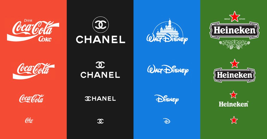
Note: Logos will be displayed within a container that measures 40 pixels in height and 200 pixels in width; hence, intricate text, details, taglines, or lengthy wordmarks may be challenging to read. It is advisable to utilize a version of your organization's logo that is optimized for smaller dimensions.
Logo Specifications
| Dimensions | The recommended dimensions are 112 pixels in height and 560 pixels in width. Logos will be resized to display at a height of 56 pixels or less within the system. |
| Format | PNG with a transparent background is recommended. JPG and GIF formats are also acceptable. |
| File Size | A file size ranging from 10 to 20 KB is recommended. |
How to Upload the Logo & Favicon
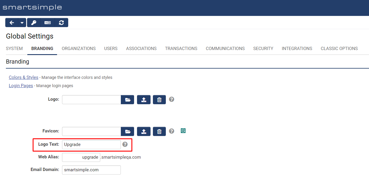
System Administration (gear icon) >> Global Settings >> Branding (tab)
- For Logo/Favicon, click on the Browse… button, represented by an open folder, and select the desired file for upload.
- Click the Upload button to submit your file.
- Refresh the cache in your browser (CTRL + F5 on PC, Cmd + R on Mac) to view your updates.
Favicon Specifications
| Dimensions | 48 pixels in height by 48 pixels in width. |
| Format | PNG or ICO format is recommended. |
| File Size | A file size ranging from 5 to 10 KB is recommended. |
Logo Text
The Logo Text setting is utilized to specify the Alt text associated with the logo. The Alt text will be displayed if there is no image or if the image fails to load. This text is also employed by assistive technology such as screen readers.
Colors and Styles
In addition to uploading image files, you have the ability to modify colors and certain styles. Should you decide to alter the colors in your system, it is imperative to maintain a contrast ratio between fonts and backgrounds of 4.5 or greater to comply with accessibility standards (Section 508 and WCAG 2.0). The following tool may be utilized to verify your contrast ratio: contrast checker by webaim.
Note: Color settings impact multiple areas within the system, and all color settings are applicable to all users. For instance, the colors visible to an administrator are identical to those seen by an applicant.
How to Modify the Colors and Styles
- Click the Colors & Styles link from within the Branding tab.
- Click on the desired color picker to select a new color or enter a Hexadecimal value (example: #000000) or choose a style.
- Click Save.
- Force a cache refresh in your browser (CTRL + F5 on PC, Cmd + R on Mac) to view your changes.
Color and Styles Settings Explained
Global Settings
| Mandatory Field Font | The color of all fields designated as mandatory. Typically, the mandatory field color is set to #D81A01, a shade of red. This color provides sufficient contrast to comply with accessibility guidelines. |
| Mandatory Field Style | Any question designated as mandatory will, by default, be prefixed with an asterisk * and must remain in this format for accessibility purposes. You may opt to change the caption color to match the mandatory field color instead of displaying an asterisk, although this is not recommended. |
| Link | The color of all text links. |
| Link Hover | The color displayed on text links when the mouse hovers over them. |
| Link Underline | All text links will be underlined by default and must remain in this format for accessibility. While you have the option to disable underlines, it is not recommended. |
| Button Font | The color utilized for text and icons within buttons. This should be set to white or a light color. |
| Button Background | Buttons will adopt this color. It is advisable to set this to a dark color for contrast. Common choices include blue, grey, or purple. Red and green are generally avoided as they are associated with error and success messaging, respectively. |
| Button Hover | This setting may be used to change the button color upon hover (mouse over). |
| Highlight | When the user clicks into an input field or tabs to an input, the focus will shift to that input. When an input is in focus, its background will change from white to the color selected in this setting. This provides an additional layer of visibility and differentiation for the currently selected input. This must be set to a light tint, such as yellow (#F7F4DA). Avoid using grey for this color as the "X" used to clear inputs will not be visible. |
| Save Button Color | Select the desired style for Save buttons on record pages. |
| Delete Button Color | Select the desired style for Delete buttons on record pages. |
Main Heading Settings
| Font | Font color for main menu links located in the header. |
| Background | The header background beneath the links and logo utilizes this color. The logo will appear over this color, as will the other text in the header. Typically, a dark color is most effective for the header. Ensure that there is a contrast ratio of 4.5 or greater between the background color and the font setting to meet accessibility standards. |
| Accent Font | Font color for the icons located in the header. |
| Accent Background | The header background beneath the icons utilizes this color. Typically, a dark color is most effective for the header accent. Ensure that there is a contrast ratio of 4.5 or greater between the accent background color and the accent font setting to meet accessibility standards. |
| Font | Text color on the user menu and in the left navigation. |
| Background | Color behind the text in the left navigation. |
Title Settings
This section governs the display of title areas found in locations such as the personal dashboard and portal sections utilizing the traditional theme.
| Font | Color of the title text, typically set to a dark shade or #000000. |
| Background | The background color of the title area, usually a light shade or #EEEEEE. |
| Bottom Border | To create separation beneath the title bar in portal sections using the Traditional theme, utilize this setting. It is generally the same color as the background for a seamless appearance, though a slightly darker shade, such as #CCCCCC, may occasionally be applied. |
Sub-Title Settings
| Font | Text color for title bars and headings within the system, generally a dark gray or #000000. |
| Bottom Border | Color for the underline of title bars and headings in the system, typically a color or a light shade of gray. |
List Settings
| Heading Font | Text color for table headers, typically a dark color similar to the button background. Avoid using white, as column headers and tables may not display correctly in certain areas of the system. |
| Heading Background | Background color for table headers, usually a variant of the header color at approximately 15% opacity. Note that the header font and background color will invert when a column header is clicked. The sorting icons for list views are a variation of the Heading Font opacity, thus it is important to adhere to accessibility standards for color contrast. |
| Top Border | Display options for the line at the top of each row in the table, providing differentiation between rows. This is typically set to a 1px solid #FFFFFF (white). |
| Bottom Border | Display options for the line at the bottom of each row in the table, enhancing differentiation between rows. This is typically set to a 1px solid #CCCCCC (light gray). |
Configuration - Advanced
Importing/Exporting Colors and Styles
You have the ability to import and export your color and style settings between different environments, or to save a copy of your settings for archival purposes. For instance, you may implement changes and test them in a backup environment, and upon satisfaction, apply all modifications simultaneously to your production environment system.
Procedure for exporting and importing colors and styles between systems
System Administration (gear icon) >> Global Settings >> Branding (tab)
- Click the Colors & Styles link.
- In the action bar near the header, click on the Export Styles button.
- A modal window will appear. Copy the code displayed in the modal window.
- Navigate to the system where you wish to apply these styles.
- Follow steps 1 through 4 above.
- In the action bar near the header, click on the Import Styles button.
- Paste the copied styles into the modal window of the target system.
- Click the Import Styles button at the bottom of the modal window.
- Confirm by clicking OK on the alert.
- Close the modal window.
- Click Save.
- Force a cache refresh in your browser (CTRL + F5 on PC, Cmd + R on Mac) to view your changes.
Tip: Uploading Images
When uploading images to your system, ensure that the images are sized to the desired dimensions and saved in the appropriate file format with compression. Image optimization is typically performed using photo editing software such as Adobe Photoshop. It is advisable to ensure that your image files are 1 MB or smaller, as larger images may take several seconds to download and could result in noticeable delays during page loading.
It is important to note that images saved at 72 pixels per inch (ppi), 240 ppi, and 500 ppi will appear identical when viewed at 200 pixels by 200 pixels. The quality of each image version is the same when displayed on screen. Higher ppi versions result in significantly larger file sizes, leading to longer loading times and increased data usage for users, without enhancing image quality on screen. If the image is intended for print in a PDF, a higher resolution such as 150 or 300 dpi (dots per inch) is acceptable. However, for images used as backgrounds in a portal or on the login page, a lower resolution of 72 ppi is recommended.
Regarding file formats, JPG and PNG are the most suitable options for your system.
JPG/JPEG (Joint Photographic Experts Group) is a lossy format best suited for images of people, landscapes, and realistic photography.
PNG (Portable Network Graphics) is a lossless format that supports transparency, making it ideal for logos, graphics, and icons.
Tip: Sourcing Imagery
If you do not have photos available for use in your system, consider utilizing websites that provide copyright-free stock photos for commercial use. Locate the images you require, crop and resize them accordingly, then upload them into your system.
Additionally, you may wish to explore the following paid stock photo websites.
For free icons:
